
How we built Enclaves: Egress Networking
How we built our Enclaves primitive, we dig into our redesign of Enclaves egress networking with iptables.
By Hannah Neary
Hannah Neary

Engineer
Our DXmas series aims to help you improve your product's developer experience. In parts one and two of the series, we introduced the principles of good Developer Experience (DX) and examined how you can better utilise your developer documentation. In this third part of the series, we're looking at how you can improve your product’s DX by better designing your website. We'll teach you the most important factors to consider when designing a website for your developer-facing business and give you a sneak peek of our (soon-to-be-released) new website.
When building a website, there’s often a temptation to rush in and start writing code that you must resist. Before you write any code or start design work, you must stop and plan the message you're trying to convey with your landing page. Otherwise, you could end up with a beautiful-looking website that doesn’t actually contain the core messaging you wish to convey.. We've been guilty of this in the past.
Not sure where to start? There are plenty of great resources for identifying your core messaging building blocks, like the Product Marketing Alliance. However, a good general guideline is to start by answering the following questions:
Next, you’ll want to layer in the following core attributes
The core messaging should inform the site's design. Only when you have that in place can you figure out how the site should look; doing it the other way could land you with a confusing and ineffective page.
Many would attribute a large portion of Stripe’s success to their core message, which they nailed at the very start. Their first homepage simply read “ Stripe: Payment processing for developers”. It perfectly distils the problem they’re solving: the difficulty of implementing payments online, what the product is: a payments solution, who it's for: developers, and why it is better: implementing payment processing sucks for developers (at least it did before Stripe solved it). To see how their website evolved with this slogan over time, check out this cool Twitter thread.
Your website's landing page is often the first content a prospective customer sees from your company. You must take advantage of this opportunity to leave a good early impression. It needs to be visually appealing and clearly explain what your prospective customers stand to gain.
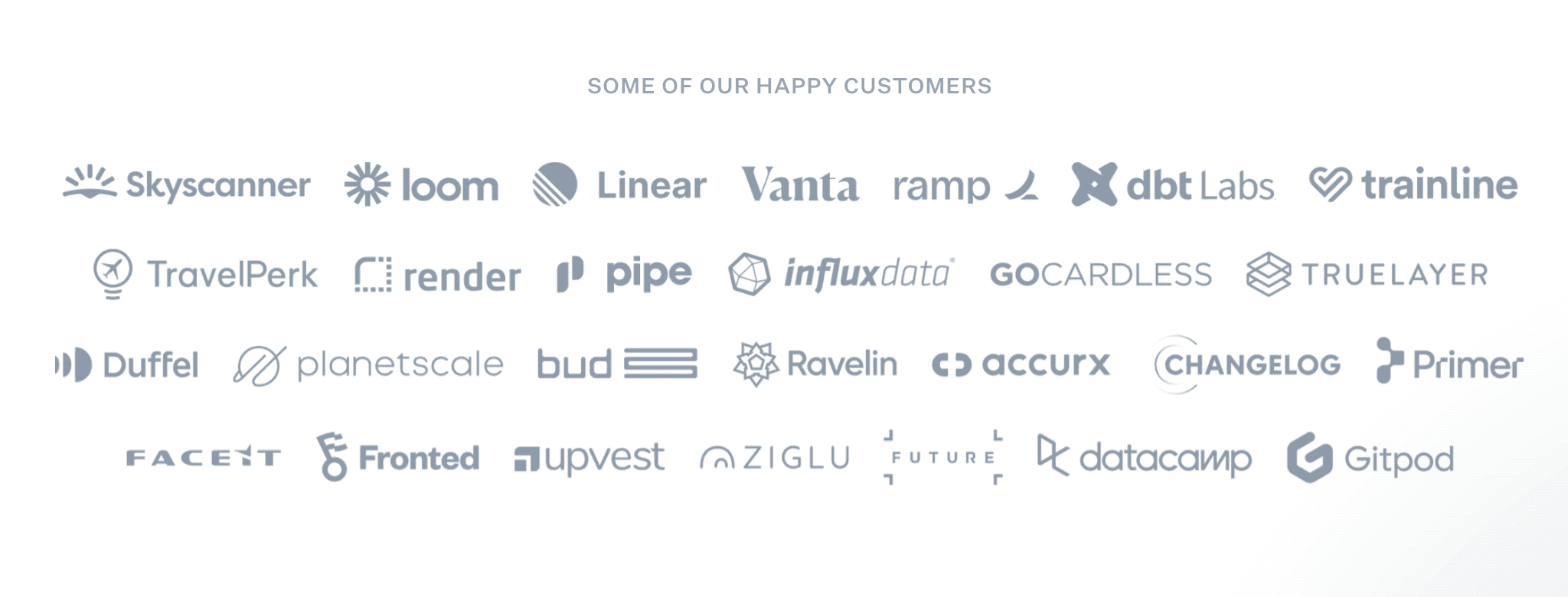
It's also extremely important to inspire trust in your company. Since Evervault manages infrastructure on behalf of our customers, we need to ensure that other companies trust us not to have downtime and to be able to manage the volume of traffic that they experience. But this is true of all companies. A powerful way to build this trust is to place logos of your biggest customers right there on the homepage. Incident.io does this well; they even have a subpage solely dedicated to their customers.
As Evervault forms part of our customer's core infrastructure, it's important that customers trust that our services are reliable, don’t have downtime, and won’t form a bottleneck in their services. If our website was slow and buggy, then they'd quickly lose that confidence, even if our product is rock solid. People judge books by their covers.
Stripe, Vercel, and Incident.io all do this very well. They all have beautifully designed websites that are cleanly designed and easily navigable. They’re highly performant; you wouldn’t notice any significant loading time when browsing them.
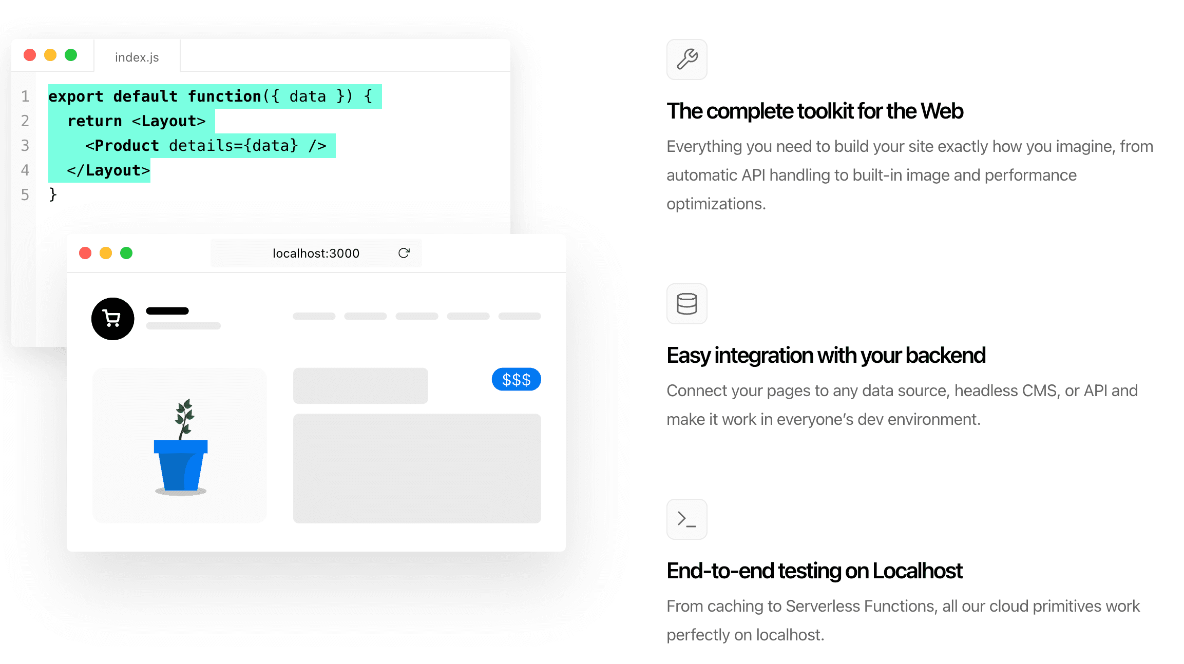
Show, don’t tell has become a bit of a recurring theme in these DXmas posts; we cannot overemphasise its importance. With your webpage, similar to your docs, you should aim to have interactive snippets where customers can play around with your product and gain a quick understanding of its core principles, inspiring plenty of “aha” moments as they learn more about it.
Ideally, the simple demos on your homepage should flow nicely into the beginner tutorials in your docs with a natural progression through the fundamental concepts. Code on your website should be copyable (Vercel does a great job of this), particularly quick scripts that users can copy and paste into their Terminal. It's frustrating for developers to see a piece of code working in an image and needing to transcribe it into your editor to play around with it.
Our website has significantly improved over time, particularly our messaging, which we continuously seek to refine.
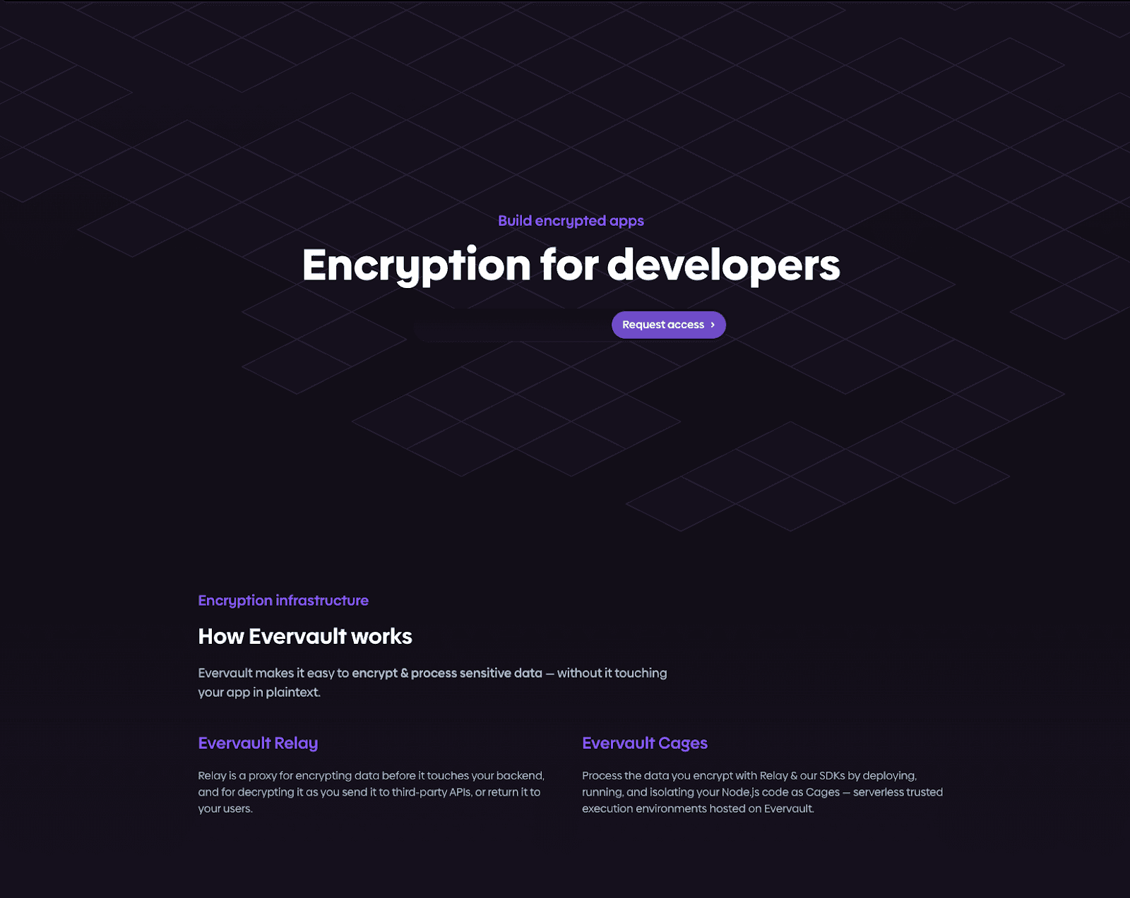
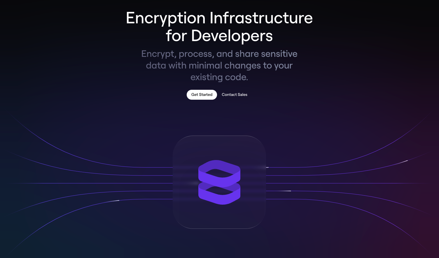
Above, you can see our home page right from before we launched in 2021. One issue with it is the "How Evervault works" section - which doesn't actually answer the question it poses. To someone very familiar with Evervault, it does a decent job. However, it means very little to you if you have no clue what a Relay or Cage is. This version of our website failed to sufficiently adhere to the principle of Show, Don't Tell. When you're intimately familiar with your product(s), it's easy to fail to realise how much context you need to provide other people. You must consciously put yourself in the shoes of someone who knows nothing about your product to overcome this.
Further down the page, there's more information about the benefits of using Relay, but the reader still hasn't been told what a Relay is. One of the killer features of Relay is that it's super easy to configure, but we don't show that off anywhere. In this case, we should have adhered to the first principle by highlighting this key feature in our messaging. It's a mistake that we've learned from.
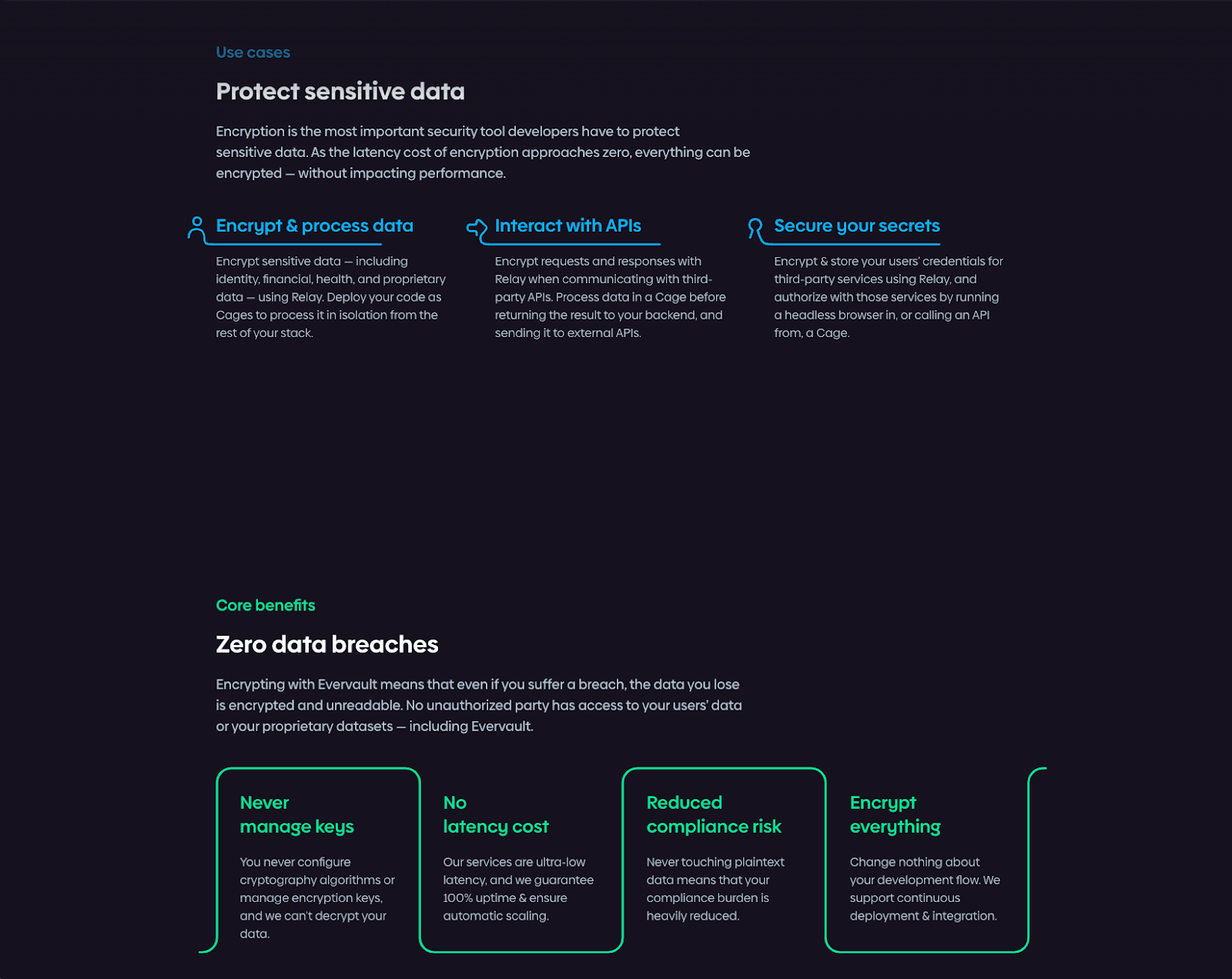
Our website banner currently looks like this, which is a great start, clearly inspired by some of the best practices above. Although when it comes to the content, cracks start to appear.
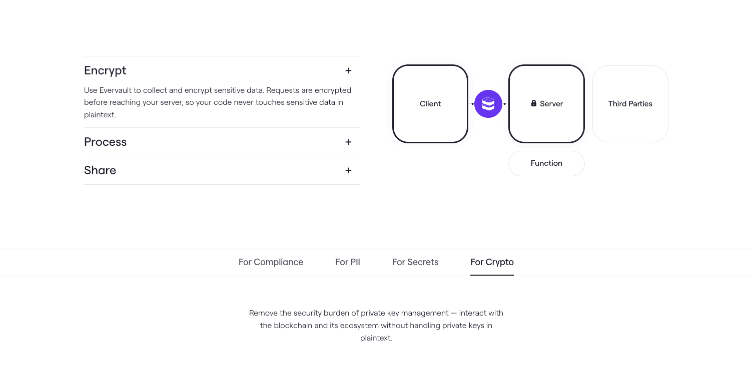
The section above explains how a potential customer might use Evervault to secure their data, but it does so in a very vague way that makes it impossible to imagine what an Evervault implementation looks like. The “Encrypt” section vaguely mentions your code not having to touch plaintext data, although it doesn’t say anything about how that will happen. Nor does it highlight the ease of implementing Relay. It’s interesting to compare it to the Vercel example above, which is trying to achieve the same thing on their homepage. However, it does so using specific examples of what they offer and even code so you can get a better grasp on it.
Just like we did with our new docs last week, we’re delighted to be able to show off a sneak preview of our new website.
The most notable change we’ve made so far is our messaging. We’ve changed from offering “Encryption Infrastructure” to an “Encryption Platform”. This aligns better with what we’re building for our customers, underlining the cohesion of our product offering relative to other patchwork solutions.
Our quest to be the world’s most developer-focused company has led us to recognise the need to rebuild our website. We hope that sharing our principles of good website design will help you identify your current website’s weaknesses and inform you how to fix those issues. But remember, your work isn’t over once you finish building your website. Make sure to keep it up to date with your latest products, features and company announcements. Speaking of, we’ll be sharing more website updates on our Twitter in the next few weeks.
Next week we’ll share the fourth and final part of our DXmas series, focusing on how you can ensure a good developer experience within your product. While you’re waiting, you can create your free Evervault account today.
How we built our Enclaves primitive, we dig into our redesign of Enclaves egress networking with iptables.
Hannah Neary
The Hidden History and Politics of Encryption Algorithms
 David Nugent